Day 17: While wandering around Nantes on Saturday morning I came across the brand new -- but not quite finished -- City Council Building. Talk about sticking out like a sore thumb. The only connection this modern-laser-cut-aluminum-panel-clad building had with it's classic-stone-and-plaster-with-slate-roof neighbors was a token classic-stone-arch at the entry. I'd like to know the design concept behind this creation and how it takes into account the local context. On the other hand, the way the sun rips across those panels is pretty cool...

Day 15: The two photos on the top were taken two weeks and almost 400km apart. Yet when superimposed they match up almost perfectly, with absolutely no cropping or offsetting or any other kind of adjustment. And they don't just fit together in terms of geometric composition. Both of these buildings -- the 104 art gallery in Paris on the left, and a student housing development for the Ecole d'Architecture in Nantes on the right -- are renovations of abandoned structures, and both renovations completely obliterate and sanitize the previous uses of those structures. I could also get into the similarity of the interior/exterior conditions and relationships, but I'd rather get on to writing captions for the other photos.

Day 16: We visited the warehouse workshop of La Machine, an association of artists/craftsmen/technicians who do some fantastic work in the realm of scenic design and construction. This particular image is a superimposition of two photos: one is a wooden model of an elephant creation, the other is a model of the structural skeleton of that same elephant. When I took the photos I was not thinking about overlaying one on top of the other, so the fact that the scale came out about equal is complete luck!

Day 16: Outside Le Lieu Unique. Nothing of architectural significance here; I was simply playing with focus and blur again. In lots of architectural photographs a long exposure is used so that the building is in crisp focus while the people inhabiting it blur out due to their movement. This makes sense, as the subject in those photographs is the building, not the people. So in this photo the car, being the subject, is kept in focus while the back- and foreground are blurred through the motion of the camera. Getting this shot involved some trial and error while I tried to rotate the camera at the same speed that the car was passing...

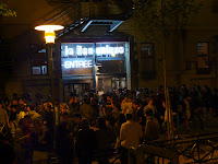
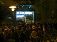
Day 16: Party at Le Lieu Unique. This is Nantes' community center, the rough equivalent of a YMCA. I don't know about you, but I've never seen this kind of a party outside our YMCA. As a photograph, I like the way the blue color of the Lieu Unique sign stands out against the yellow wash thrown on everything else from the lamp post.

Day 16: Still partying at Le Lieu Unique. A more standard building-in-focus/people-blurred photo. I like imagining what the people were doing to cause the different amounts of blur -- like what's going on with the very ghosted individual that cuts across the middle of the bottom third of the frame?

day 16: The party inside Le Lieu Unique. The lighting was terrible, and I didn't want to pull out the tripod, so it's kinda blurry and definitely grainy/noisy. But I love the way everyone is facing the bright white area on the right and holding one arm in the air like they're all reaching for the same point on the ceiling. Getting a bunch of strangers to reveal common characteristics by getting them to act in unison is always fun.

Day 16: This is what everyone in the previous photo was facing: a crazy-ass charades game. What I enjoy in this photo is the interplay between then drawings and the live people. When I glance casually at the image, it looks like the drawing in the middle is an actual person crouched down to draw. And it looks like the drawing on the right is dripping on the person in black. Meanwhile, the reflection of light makes it look like the man in white on the left has one black lens in his glasses and one white. This was a crazy party, indeed.

Day 16: The dance party portion of the night at Le Lieu Unique. Remember, this is the community center for the city of Nantes. The age range on the dance floor, which is next to the bar, at this exact time was from 5yrs old to 60yrs old. Seriously, one guy had his 5-yr old daughter on his shoulders, and there were senior citizens walking through (though they didn't stick around very long). This photo would have been more fun if the clock didn't read 11:38pm... I'm not much of a dance party person, so I left a little after midnight.

Day 17: At the Aureole 14 sight in St Nazaire (an old WWII German u-boat base converted into a concert venue/community use center). I was having fun with reflections here. The sunny day, plus the dim interior space, plus the shape of the structure made for a nice picture-in-picture effect when I caught this reflection in the window of the restaurant housed within on of the dock bays.

Day 17: One of our instructors, Steven Christensen, takes a picture of the ceiling at Aureole 14. I'll admit that this photo is heavily processed. It was converted to black and white in such a way as to mostly wash out whatever was in the white area, then the levels were adjusted to further enhance the brightness of the white. I just wish Steven had been standing one step to the right.

Day 17: Still at Aureole 14. I liked the way the dock bay opening framed the top and sides of the lighted area, and the reflection and ripples in the water completed the frame, allowing the bottom to dissolve gradually.

Day 17: Evening at Aureole 14. I wish I had been using a lower ISO setting/wider aperture setting. This also could have been framed better: the pink square near the middle is too high and too far to the left. And there's that funny black puddle in the middle/left of the frame. Even so, I like that the lights on top look like straight lines, while their respective light pools on the floor are a diagonal/triangular pattern.

Day 17: More evening at Aureole 14. This was playing with a long exposure (6 seconds) and deliberately moving the camera while the shutter was open. Not all that great, but kinda fun.

Day 18: On the roof of Aureole 14. As this was a repair facility for German U-boats during WWII, it is an extremely heavily fortified structure. The roof 4 layers of concrete ceiling, and this photo was taken in the space between the top two layers. It was creepy enough being in there, and inverting the image to a negative makes it even creepier.

The original of the image above.

Day 18: The panoramic, 360-degree view from the roof of Aureole 14. The top image is one that I put together, with no manipulation of the individual photos. The middle image is the one that PhotoShop put together (I used the automatic photomerge function). And the bottom image is the same PhotoShop assembly, just cut and re-spliced so that the center of the photo is looking north instead of south.
And, just like the last post, here are all the shots that didn't make the cut to get into the final presentation:

Same as the shot that did make the cut, but the colors have been adjusted here.

Same shot as before, only this time every color except blue has been desaturated.


I couldn't decide which of these two photos I liked better, so they both lost...

Some of the icons found in and around Lieu Unique. Kinda reminds me of the student center at IIT.


Four different ways to crop the same shot. one was cropped to center the green area in the middle while preserving the original aspect ratio of the photo, another prioritized centering of the green above all else, another tried to balance the brown color areas on the left and right, and another included people down at the bottom of the frame. Decide for yourself which you like best.

One of La Machine's machines. I'm amused by the way both the actual construction and the photo of the construction (which is under construction in the photo) have the same expression. I'm doubly amused by the way the lamp at the end of the arm coming off the real construction becomes the eye of the construction in the photo.

More experiments with photographing reflections. Also, that's not me in the reflection taking a photo. That's another shot of Steven Christensen. He takes a lot of photos...

Lying on the floor, looking straight up at little hanging lights (the same seen in photos 13 and 14 of those that made the cut).
No comments:
Post a Comment